Peking University Library System & Design Framework
2013 - 2018 | UX Lead
My role
As the sole UX professional in the entire library system, I led the end-to-end product design and implementation of the Peking University Libraries Portal with strong partnership with the team & 20+ stakeholders. My work includes:
Strategy setting
User research
Information architecture
End-to-end detailed design
Design & visual framework
The final result was well-received by users and leadership and was scaled to the entire library system and adopted by other academic libraries, too. I also presented my learnings at the IFLA 2018 conference and IFLA 2019 conference.
Background
Peking University library system is the biggest academic & research library system in China, serving both academia and the general public with 40+ libraries and a collection of 9 million books and 882 databases. Most of the library services, e.g. searching, and consultation, are offered via the digital portal system.
The problem, as it started
There has been a large number of user feedback in person and online forms complaining that the portal is outdated and people have a hard time finding what they need.
I can’t find the research article I needed for my dissertation. - Helpdesk users
The portal is so outdated. It seems like I have to use Internet Explorer 6 to access the website. - Online forum
Accessing the library website on a mobile phone is a disaster. - Online forum
The website is inconvenient and not beautiful. - Online forum
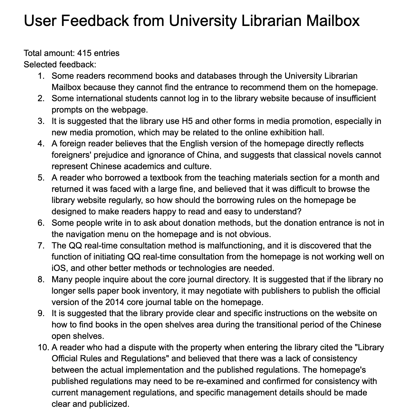
There were lots of letters asking about job openings. - University Librarian's Mailbox
Given a large number of user complaints and overall lack of design, the library leadership team initiated a redesign project: design a new portal for the library system to make it work and look better.
My approach
-
Advocate for user-centered methods to re-define the problem space and project goal
-
Design a modern and engaging experience that supports key user needs
-
Templatize the design and extend it to all branch libraries
Deconstruct the goal
While “Make it work and look better” was the consensus, it is also too vague and not readily actionable. Specifically, what are the aspects and key problems contributing to today’s poor experience? Is it only about the look and feel or is there more underlying cohesion in it?
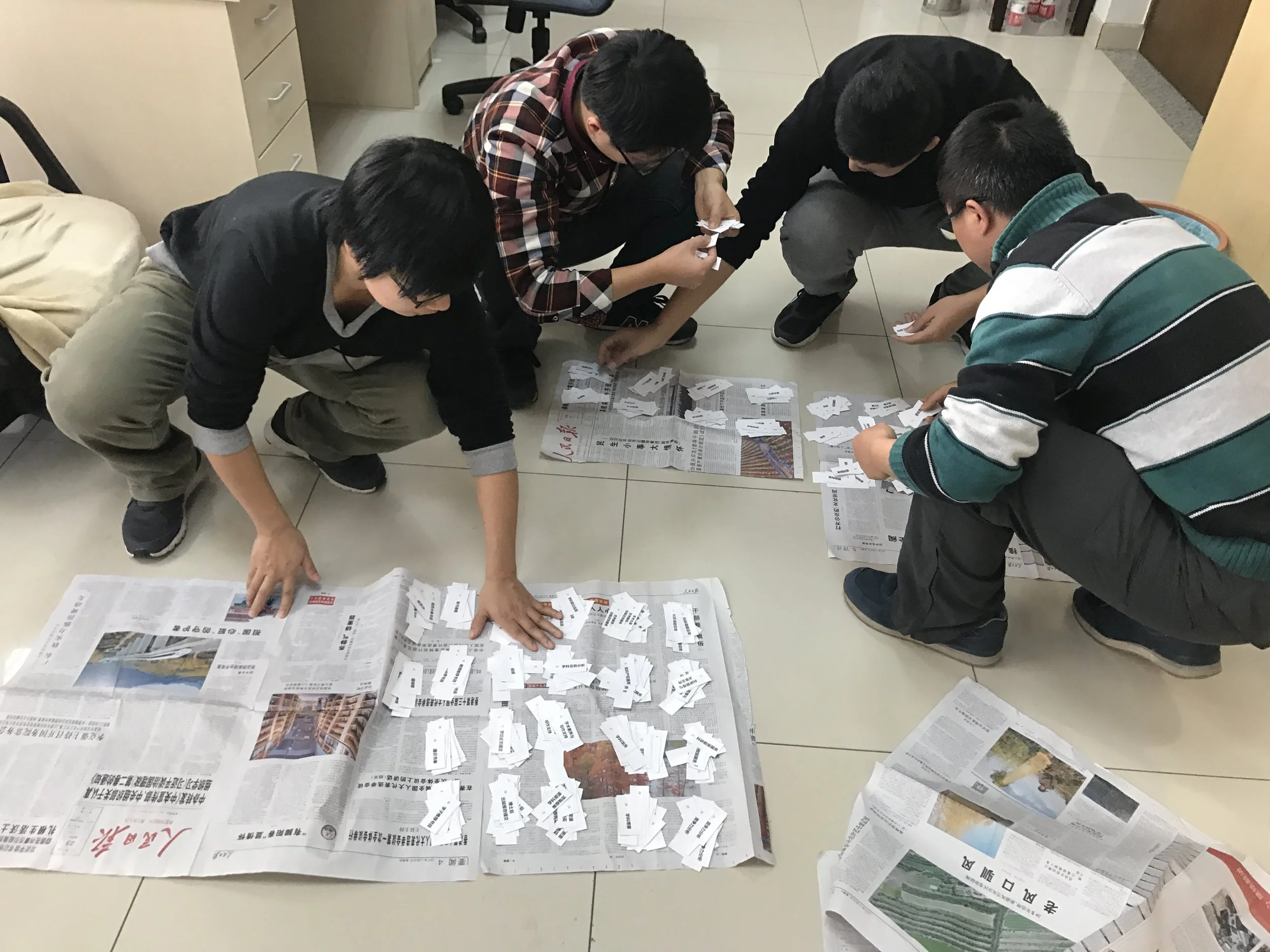
The need for user research
In order to dig deeper into the problem space to identify and solve for the right user problems, I managed to persuade the leadership for room for user research, facing very limited resources and super tight timeline.
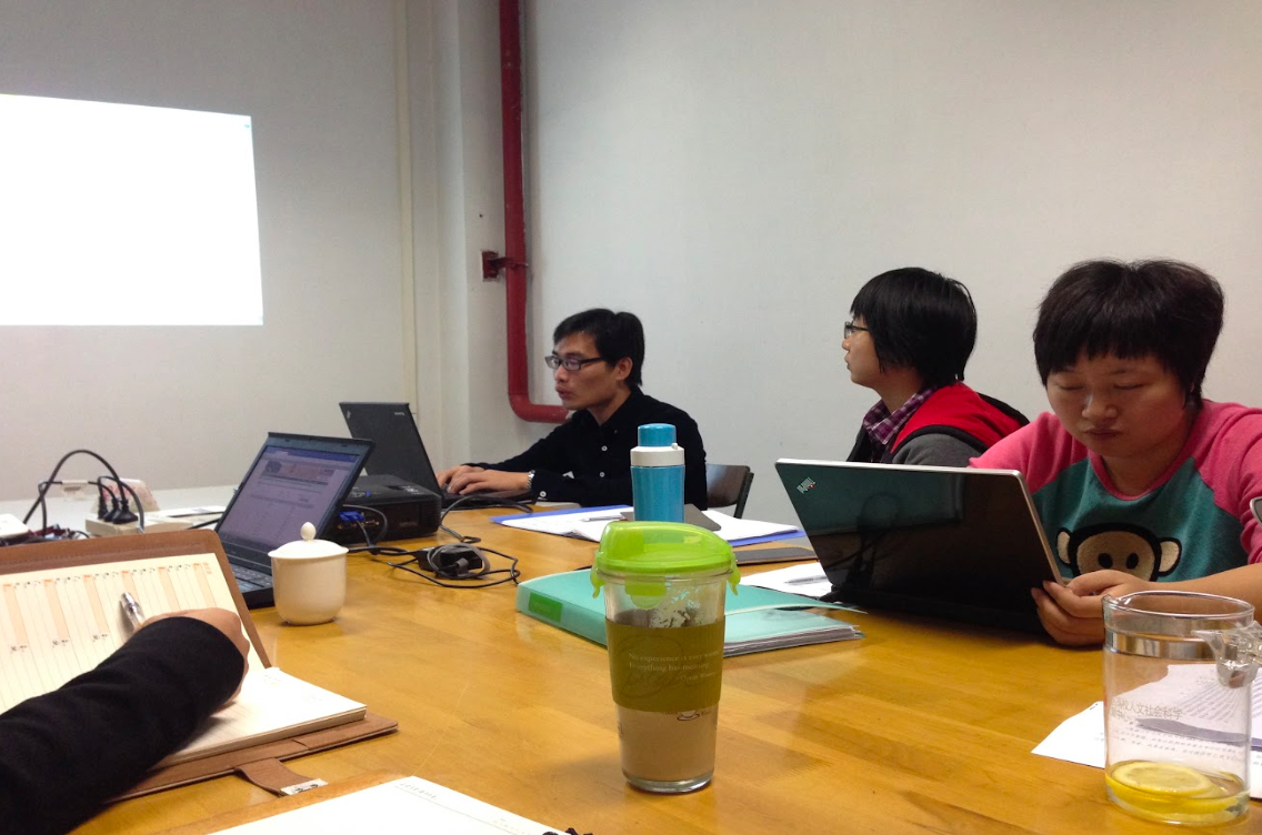
User research
-
![]()
Competitive analysis
on library system of world’s top 50 universities
-
![]()
Heuristic evaluation
on existing portal
-
![]()
Focus group
with the library staff
-
![]()
Contextual inquiries
with students and professors
-
![]()
Aggregated user feedback
from the online forum and mailbox for the past 3 years
-
![]()
Card sorting exercise
on information architecture and search box preference
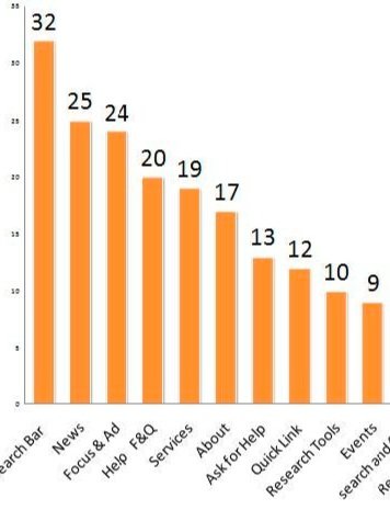
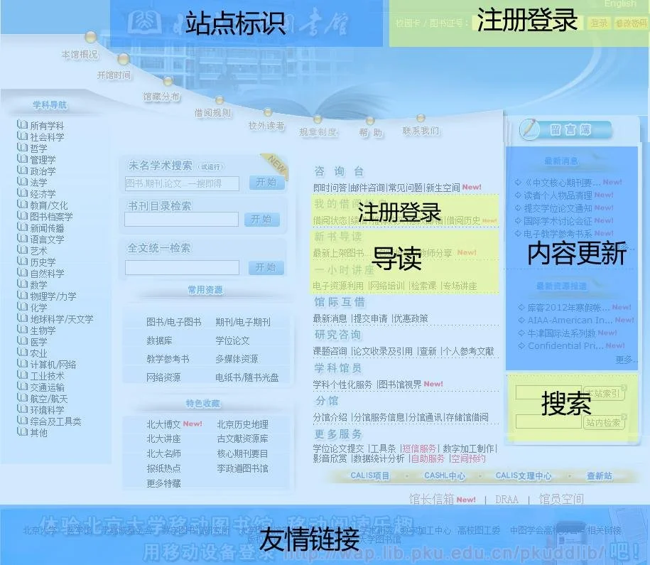

Key problems identified
A couple of key problems to merge:
-
The information architecture was based on traditional library services that focus on searching for books. The key user needs in the digital era (e.g. open access, targeted research consultation) were not met.
The portal was a mirror of internal organizations - listing services and resources based on departments and groups within the library, which may be vastly different from the user’s perspective.
-
The site was plagued with many usability issues. Confusing navigation, inconsistent patterns and components, arbitrary use of colors and images, lack of clear interaction affordance, just to name a few.
-
60% of Chinese use smartphones to access the Internet. However, there was no mobile friendly version. The only mobile portal was WAP based with extremely limited content and visitors.
-
English version and Chinese version had completely different content and interface, which posed significant difficulties for visiting scholars and international students.
-
The library portal and its subsequent pages were very practical and blunt. The layout, the color, and the use of icons all seem random. It feels like a mechanism to complete a task, which does not encourage exploration. In other words, the design is strictly utilitarian. The design also didn’t feel like part of Peking University.
Project goal & prioritization redefined
Powered by the research findings & user-centered approach, I began a series of discussions with the leadership team to crystalize the goal and scope of the project. Eventually, after a few rounds of discussions and light workshops, we landed on the improved goal which later also guided us through the continuous improvement:
Create a modern digital library experience that helps students and the faculty navigate services, discover & find resources, engage in academic & cultural activities, and get help when needed, all with ease and delight.
a multi-year & iterative program
Milestones
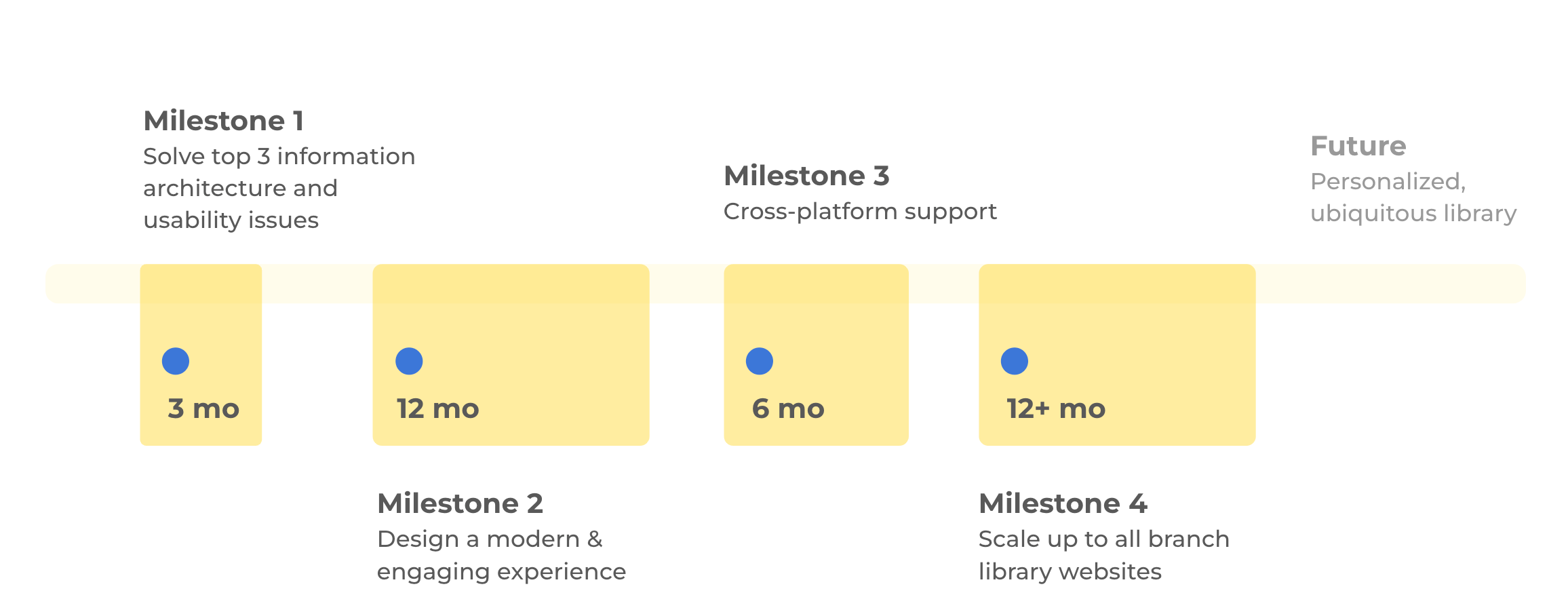
Milestone #1: Design for key user needs
We prioritized and scope down the MVP release to meet the most critical user journeys:
Our focus was on helping students and faculty members navigate library services, as well as discover and find resources.
The main goal was to make the library experience useful and usable
navigate library services & resources
Search or browse information
Global search & guided category searches
personalize library use
Designed “MyLibrary” feature that allows users to have a space to design their own homepage, store usage preferences, and cherish their memories with the library
engage in academic & cultural activities
Designed “Calendar” for users to follow library events and export to their own calendar app
Integrating & promoting events throughout the portal design
Milestone #2: A modern & delightful design
modern layout & visual identity
Full-page immersive design (e.g. video background) creates an inviting and modern identity for the library
cross-platform support
Added full support for mobile via responsive design, achieved feature parity between mobile and desktop
internationalization
Design for both Chinese and English at the same time, with layout, feature and content parity
Milestone #3: scale the design
Peking University Library System consists of 40+ branch libraries. Most of the branch libraries don’t have websites. Some libraries have their own websites, but they are poorly maintained because there aren't enough librarians to be able to update the website after they've done reader service. There is no reliable place to find the resources and services of the branch library.
How to improve the informatization of branch services without adding too much maintenance burden to librarians?
How to help readers quickly know about a branch?
How to scale the design?
I conducted exploratory research on all 40+ branch libraries and contextual inquiry with selected 9 libraries to learn about their resource constraints, tech-savviness, content requirements, and user needs. Based on the results, I proposed and created a 3-tier design framework for the library system, balancing consistency and feature customizations:
Tier 1: Customized
Fully customizable designs for special libraries
Tier 2: Standard
Templated homepage & search for common use cases
Tier 3: Static
Static info page with no maintenance
Future vision: ubiquitous library
Libraries are no longer just repositories for books and academic resources. They are vibrant multi-functional spaces that promote learning, creativity, and relaxation. However, despite the wide range of services provided by large university libraries such as Peking University, many readers are unfamiliar with the library's branches and services beyond their own departments.
How can we make these resources accessible to a wider audience?
How can we empower students and teachers to discover the interdisciplinary resources available and have more options for study and discussion?
My next step is to develop a comprehensive library navigation system that allows readers to easily discover books, tools, services, and spaces offered by the university library across campus. With this system, readers can access the full potential of a modern library's resources.
Campus library navigation
Direct readers to any library on campus and help them find the optimal route to a certain bookshelf, a particular book, a seminar room, a printing machine, a restroom, a library workshop, an exhibition, a drinking fountain, a vending machine, and so on.
Library service by your side
Easily find and access library services with just a few clicks. Simply enter your needs in the navigation, locate the nearest library that offers the service, check availability, make an appointment, and go.
Face-to-face borrowing
Skip the waiting time for returned books to be checked back in.
Easily find the book you want and directly chat with the person who currently has it.
Simply arrange a face-to-face meeting to check out the book on your phone.
Impact
Improved metrics and positive user feedback
45% decrease in Help desk inquiries on finding resources after all milestones are launched.
Positive feedback on improved usefulness, usability and aesthetics:
“I like the Event calendar the most - it’s so useful to find latest seminars and workshops”
“When other universities still have the 90s website but ours are so modern, this makes me proud of my university”
Experience sharing on international conferences
I presented my learnings at IFLA WLIC 2017 conference at Wrocław, Poland: "It's My Library": An Immersive, Empathic and Collaborative Approach to Online Storytelling Design
IFLA WLIC 2018 conference at Kuala Lumpur, Malaysia: User Delight - Advancing library user experience to the next Level
Design scaled up and beyond the university
The design was scaled to the entire library system with 40+ branches and the design was even ported to other academic libraries in China, too.
Example: University of Chinese Academic of Sciences Library and University of Science and Technology of China Library)
Challenges & learnings
Organizational mindet
Most librarians were trained to use paper catalog and collections, with existing mental models on how things work. It requires a lot UX education.
Lack of quantitative metrics
We did not have professional analytic support due to regulations and limited resources. (e.g. no Google Analytics), so qualitative user research is the only way to get feedback.
So many hats!
I was the sole UX for the entire department for the entire duration, so I wore many hats at the same time - designer, researcher, facilitators, product managers, etc. I had to prioritize constantly.