DriveWealth Hub Redesign
OCT 2023 - JUN 2024 | Product designer
My role
Set product vision in the concept stage
Redesigned 5+ key user journeys
Facilitated cross-functional communication and leadership buy-ins
Worked closely with engineering for the implementation
Background & context

DriveWealth
DriveWealth is a leading global fintech platform that offers comprehensive Brokerage-as-a-Service API solutions to its clients, who are usually consumer-facing financial companies. DriveWealth processes millions of transaction requests per day.
Drive Hub
Drive Hub is the centralized, one-stop data nexus that provides a complete view and management of enterprise and end-user accounts, orders, settlements, operations, servicing, and reporting. Its primary users are client operation teams and Drivewealth internal teams.
The problem
The existing product was long plagued with years of UX and technical debts, plus incremental feature additions that often failed to account for the overall user experience. As a result, there were frequent user complaints from our clients and a long development backlog.
Goal
Create an optimized and intuitive DriveWealth hub experience that streamlines critical client and internal workflows, provides key metrics and actionable insights, simplifies account lifecycle management, and drastically improves its overall ease of use.
My approach
-
Focus on fundamental user needs. Reset to ground zero. Craft a compelling high-level concept to spark enthusiasm, showcase the value of UX, and get stakeholder and leadership buy-ins.
-
Develop key user journeys and comprehensive features, following an agile development approach for continuous iteration and efficient delivery.
The refreshed concept
Within 4 weeks, I quickly ramped up, went through 5+ design iterations, created an animated prototype, and presented it to the team and the CPO.
The goal was to:
Reignite xFN enthusiasm with a completely fresh new look
Demonstrate the value of UX improvements
Showcase new capabilities and workflow impacts
The concept was met with critical acclaim from the leadership and xFN partners. With the project buy-in from the leadership established, I started designing and iterating on the detailed user journeys and features.

*NDA restrictions limit some project details and visuals. This case study focuses on the design process.
Detailed user journeys
Partnering with the Design Director, we identified 5 key focus areas for the DriveWealth Hub MVP: intuitive navigation, a data-driven dashboard, a streamlined admin center, efficient account management, and a foundational design system.

*NDA restrictions limit some project details and visuals. This case study focuses on the design process.
# Navigation
We revamped the navigational UI with a focus on productivity and scalability. By minimizing clicks for task initiation and reducing clutter, users can navigate seamlessly and multi-task between screens with ease.
Key improvements include:
Prioritized primary tasks with reduced clicks
Clean, modern, and decluttered interface
Fully expandable and responsive menu for easy context switch

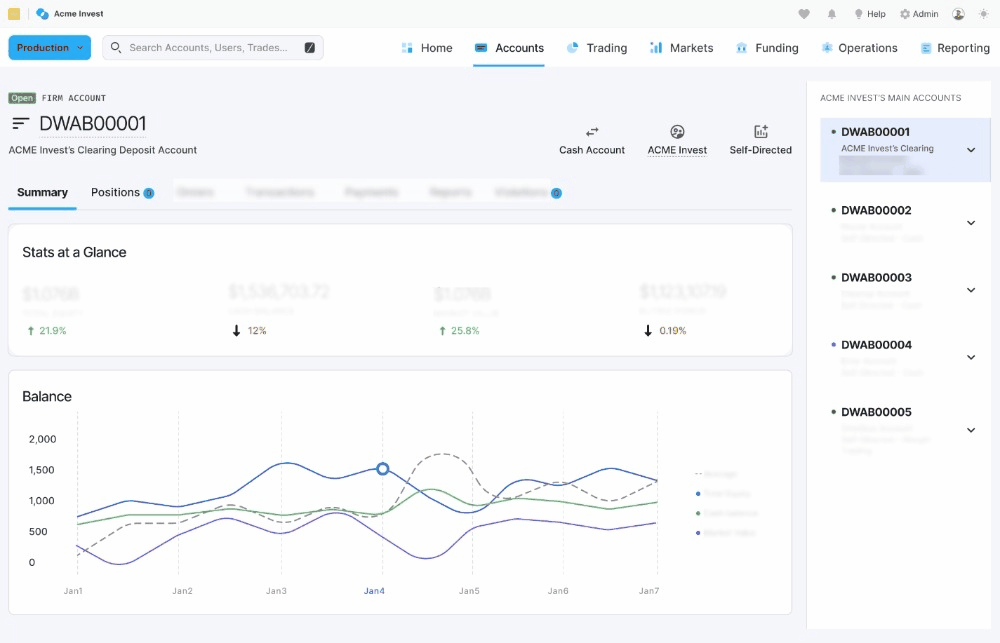
# Dashboard
Drivewealth Hub didn’t have a dashboard, which often led users to find what they needed in the myriad of menu options. I designed an all-new, customizable dashboard that serves as the central landing page for DriveWealth Hub, filled with key business metrics, insights, and actions to take. Further, the dashboard is also fully customizable, enabling users to tailor the experience for specific roles and needs.
Key improvements include:
Key metrics and insights with clean and intuitive data visualization
Actions to take section that enables users to quickly resolve issues without getting lost in leaf pages
Customizable UI that allows users to personalize the experience for their own needs
*NDA restrictions limit some project details and visuals. This case study focuses on the design process.

# Admin center
Admins frequently need to manage partner profiles, API environments, roles, and activity logs. However, prior to the redesign these functionalities were fragmented and dispersed across the platform, forcing users to navigate multiple sections and memorize locations. It was one of the top user complaints. To address this, we designed the new Admin Center. This center brings all partner management functions together in a single, intuitive interface.
The Admin Center has a single entry point from the navigation and aggregated view. It presents a much cleaner mental model that separates admin tasks and business tasks, which drastically streamlines user journeys, reduces context switches, and improves productivity.
*NDA restrictions limit some project details and visuals. This case study focuses on the design process.

# Accounts
DriveWealth Hub manages two account types: client (corporate) and end-investor. However, the data from those two account types were often mixed together in the system without clear separation. As a result, clients with intricate organizational structures face major challenges and often rely on :
Inefficient and time searches, cumbersome and confusing navigations, and often reactive management via email and notifications to manage and troubleshoot their accounts.
The Account section redesign focuses on streamlining account management for complex structures.
Introduced a hierarchical view as the main affordance, allowing drilling down into child accounts to provide a comprehensive, high-level view of the entire account structure and navigate layer by layer.
With the redesigned account view, clients can easily manage all their accounts without the complicated search and lengthy navigations, and can further proactively identify potential issues much earlier.
*NDA restrictions limit some project details and visuals. This case study focuses on the design process.
# Design system
Led the development of a robust design system, driving design consistency and across products. (More details: Drivewealth Design System)
MUI as the foundation: Leveraged the MUI framework as a base while incorporating the latest UX/UI trends and best practices. This ensured a balance between familiarity for developers and a modern aesthetic.
Cross-functional collaboration: Closely collaborated with the engineering team throughout the process for technical feasibility for each component.
Scalable system: Developed over 60+ components, with ongoing efforts to expand and refine the system as needed.
*NDA restrictions limit some project details and visuals. This case study focuses on the design process.

Challenges and learning
Limited ramp-up time. Joining the project in my fourth month, I tackled the challenge of quickly understanding a complex system and its strategic goals. I rapidly adapted to the new domain, scaled my understanding and delivered meaningful results.
Balance tech debt, business goals and optimal user experience. The system was 5+ years old with lots of hidden tech debts and intertwined user experience. Often, a small change could easily lead to scope creep that quickly becomes a large scale change. I collaborated closely with the team and constantly prioritized features that interest with user values and business goals.
Manage diverse stakeholders. In addition to the design team and intermediate xFN teams, the project has top visibility in the company including CEO, CFO, CPO and marketing. I used various ways to engage with high-level stakeholders and ensured buy-ins from all levels.
Impact
Product Impact
The redesign is expected to have the following significant impacts:
solve key user pain points = which would lead to fewer customer complaints and support calls
greatly improve client and internal team’s daily operational productivity, enabling teams to focus on more high-impact work
delight users via a major visual design facelift including a new color palette, light/dark mode, and partner theme
Positive leadership feedback and long-lasting impact
Not only did the redesign receive positive feedback from the UX and cross-functional teams, it also achieved all-around leadership buy-in. It was prominently featured in the October company-wide town hall, presented as one of the future-changing initiatives for DriveWealth 2024. The redesign also set a successful role model for continued UX improvement and investment - laid a robust foundation for more user-centric improvements to other parts of DriveWealth Hub in 2024.